Every time you pick up a prescription, there’s a small piece of paper stuck to the bottle that could mean the difference between healing and harm. Pharmacy labels and warning stickers aren’t just bureaucratic clutter-they’re your first line of defense against dangerous mistakes. Yet most people glance at them quickly, if at all. By 2025, federal rules will force pharmacies to make these labels clearer, easier to read, and more consistent across the country. But right now, the system is still a patchwork. Knowing how to read them properly isn’t just helpful-it’s essential.
What’s Actually on Your Prescription Label?
Your prescription label has to include a few basic things by law: your name, the drug name, how much to take, and when. But beyond that, what’s printed can vary wildly depending on your state, your pharmacy, or even the chain you use. Some labels use tiny 5-point font. Others add bright orange warning stickers. Some include QR codes that link to video instructions. Others don’t even spell out the reason you’re taking the medicine.
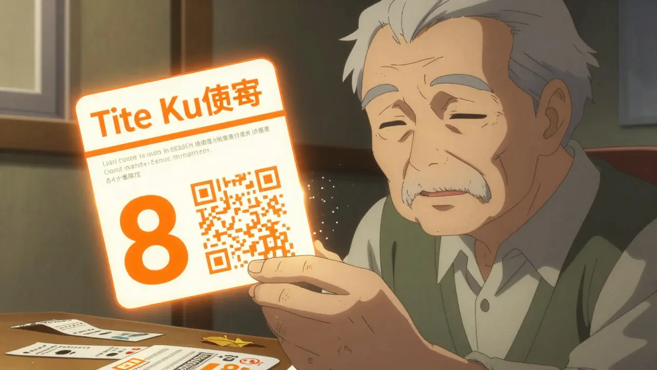
The FDA requires only the bare minimum: patient name, drug name, dosage, and directions. Everything else? That’s up to the state. Connecticut, for example, now requires a fluorescent orange, 1.25-inch diameter warning sticker on every opioid prescription. California mandates multilingual instructions for patients who don’t speak English fluently. In other states, you might get a plain white label with no warnings at all.
Why Warning Stickers Matter-And What They Mean
Warning stickers aren’t decorative. They’re urgent. The most common ones you’ll see are red or orange, with bold white text. Common phrases include:
- CAUTION: OPIOID-Risk of Overdose and Addiction - This sticker is now required in 27 states. It’s not just a reminder. It’s a legal requirement for pharmacies to alert patients to life-threatening risks.
- May cause drowsiness. Do not operate machinery. - This isn’t generic advice. It’s based on clinical data showing this drug slows reaction time by up to 40%.
- Take on an empty stomach. - Some medications are absorbed poorly if taken with food. Missing this detail can cut effectiveness by half.
- Do not drink alcohol. - Alcohol combined with certain painkillers or antidepressants can stop your breathing. This warning saves lives.
These stickers follow strict design rules. By 2025, federal standards will require all warning text to be at least 8-point font, printed in high-contrast colors (black on yellow, white on orange), and placed where your eyes naturally land when you pick up the bottle. No more hiding warnings on the bottom of the label.
The Font Size That Could Save Your Life
A 2023 AARP survey found that 68% of adults over 65 have trouble reading standard prescription labels. Why? Font sizes as small as 5-point. Contrast so low it’s hard to tell black text from dark blue. Spacing so tight it blurs together.
New rules are changing that. The USP General Chapter <17>-a voluntary standard now being adopted by states-requires:
- Minimum 6-point font for basic instructions
- 8-point or larger for warnings
- Sans-serif fonts like Arial or Helvetica (easier to read than fancy script fonts)
- At least 4.5:1 contrast ratio between text and background
That means no more tiny, faded text. Labels will be designed for aging eyes, low vision, and poor lighting. If you can’t read your label without holding it up to a lamp, your pharmacy is already behind the curve.
Barcodes and QR Codes: More Than Just Scanning
Every prescription label now has a barcode. But it’s not just for the pharmacist. The barcode encodes your National Drug Code (NDC), lot number, and expiration date. Pharmacy scanners check that the right drug is going to the right person. Mistakes drop by 30% when these systems work right.
Newer labels are adding QR codes. Scan one with your phone, and you might get:
- A video showing how to take the pill correctly
- A list of side effects explained in plain language
- Links to patient support programs
In 2024, 18% of prescriptions included QR codes. By 2027, that number could hit 75%. This isn’t futuristic tech-it’s becoming standard. If your label has a QR code, use it. It’s free, easy, and often explains things your pharmacist didn’t have time to say.
Why State Rules Are All Over the Place
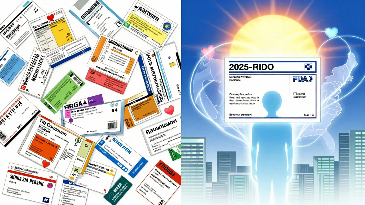
There’s no single national standard for prescription labels. The FDA sets the floor. States can-and do-add more. That’s why your neighbor’s label looks nothing like yours, even if you both take the same drug.
Connecticut’s orange opioid sticker? Unique to that state. California’s Spanish and Mandarin translations? Only required there. Other states have no special warnings at all. This creates confusion. A patient who moves from Texas to New York might not recognize a new warning sticker. A senior on multiple meds might miss a critical alert because the layout changed.
That’s why the FDA’s new Patient Medication Information (PMI) rule is such a big deal. Starting in 2025, every pharmacy in the U.S. will use a single, standardized format. One page. One layout. Same font. Same warning placement. Same color scheme. No more guessing.
What You Should Do Right Now
You don’t have to wait for 2025 to protect yourself. Here’s what to do today:
- Read the label out loud. Say the dosage, timing, and warnings aloud. If you stumble, you’re not alone. Many people misread labels because they’re designed poorly.
- Check the font size. If you need glasses to read it, ask for a larger-print copy. Pharmacies are required to provide this at no extra cost.
- Compare labels. If you take five different pills, lay them side by side. Do they all use the same terms? “Take once daily” vs. “Take one pill a day”? Inconsistencies cause errors.
- Ask for a written summary. Request a printed sheet that explains your meds in plain language. Many pharmacies have these ready.
- Use the QR code. If there’s one, scan it. Watch the video. It’s often clearer than the label.
What’s Coming in 2025-and Why It Matters
The FDA’s PMI rule isn’t just a redesign. It’s a safety revolution. By 2025, every prescription label will include:
- A single-page format with clear headings: What This Medicine Is For, How to Take It, When to Call Your Doctor, Side Effects
- Standardized icons (like a clock for timing, a skull for serious warnings)
- Consistent placement of warnings-no more burying them
- Language that matches the average American’s reading level (6th-8th grade)
This change affects 5.8 billion prescriptions a year. The goal? Reduce medication errors by up to 30%, according to pilot studies from 15 states. That’s tens of thousands of hospital visits avoided annually.
Small pharmacies may struggle with the cost-up to $15,000 to upgrade software and train staff. But the payoff is clear: fewer deaths, fewer ER trips, and more people taking their meds correctly.
What to Do If You’re Still Confused
If you’re unsure what a label says, don’t guess. Don’t assume. Don’t skip a dose because you’re afraid of side effects. Call your pharmacist. They’re trained to explain this stuff. Bring your label. Point to the part you don’t understand. Most will sit down with you, no appointment needed.
You can also check the FDA’s official guidance documents (Docket FDA-2011-D-0694) or your state’s board of pharmacy website. California, for example, has sample labels in 12 languages. If you’re helping an older relative, print out a simple checklist:
Drug Name, Dose, Time, Warning, QR Code? Tape it to the medicine cabinet.
Final Thought: Your Label Is Your Right
You paid for this medicine. You have the right to understand how to use it safely. Labels aren’t meant to confuse you. They’re meant to protect you. If your label looks like a legal document written in invisible ink, you’re not the problem. The system is.
The changes coming in 2025 are long overdue. But you don’t have to wait. Start reading your labels like your life depends on it-because it does.
What should I do if I can’t read the text on my prescription label?
Ask your pharmacist for a large-print version. By law, pharmacies must provide this at no cost. You can also request a printed summary in plain language or ask for a QR code to be scanned for you. If the label is too small or low-contrast, it may not meet upcoming federal standards-and you have the right to a readable version now.
Why do some prescription labels have orange stickers and others don’t?
It depends on your state. Connecticut, for example, requires a fluorescent orange 1.25-inch sticker on all opioid prescriptions. Other states have no such rule. The FDA’s new 2025 Patient Medication Information rule will standardize warning placement and color nationwide, but until then, you’ll see differences based on where you live or where your pharmacy is located.
Are QR codes on prescription labels safe to scan?
Yes. QR codes on FDA-regulated prescriptions link only to official, verified information from your pharmacy or drug manufacturer. They do not collect data or redirect to ads. If you’re unsure, ask your pharmacist to scan it for you. The content is always educational-never commercial.
Can I request a multilingual label if I don’t speak English well?
In some states like California, pharmacies are required to provide labels in multiple languages, including Spanish, Mandarin, and Vietnamese. Even if your state doesn’t require it, you can still ask. Many pharmacies have translated materials on hand. If they don’t, they can print a simple instruction sheet in your language at no cost.
What’s the difference between a pharmacy label and the drug’s package insert?
The pharmacy label is your quick-reference guide: what to take, when, and key warnings. The package insert is the full clinical document from the drugmaker, with detailed side effects, drug interactions, and research data. The label is for you. The insert is for doctors and pharmacists. Always rely on the label for daily use, but ask your pharmacist if you need deeper details.


Haley Parizo
They’re not just labels-they’re life rafts. I’ve seen grandmas miss doses because the font was smaller than a mosquito’s eyelash. And don’t get me started on how some pharmacies still use that ugly serif font like it’s 1998. If you’re gonna put a warning that says ‘can stop your breathing,’ at least make it legible without a magnifying glass. This 2025 standard? Long overdue. But why did it take a federal mandate to stop treating patients like they’re supposed to decode ancient hieroglyphs?
Ian Detrick
Man, I used to ignore these things too-until my buddy overdosed on oxycodone because he thought ‘take as needed’ meant ‘take whenever I feel like it.’ That orange sticker? It’s not decoration. It’s a scream. And the QR codes? Genius. My dad scans his every morning. Says it’s like having a pharmacist whispering in his ear. We need more of this-less paperwork, more clarity.
Sarah Little
From a pharmacoeconomic standpoint, the fragmentation of state-level regulatory frameworks has created significant information asymmetry in patient-facing pharmaceutical communication channels. The absence of a unified nomenclature protocol exacerbates non-adherence rates, particularly among geriatric polypharmacy cohorts. The FDA’s PMI initiative represents a necessary convergence toward standardized patient-centered information architecture, reducing cognitive load and mitigating iatrogenic risk through perceptual salience optimization.
innocent massawe
Wow. This is so important. In Nigeria, we don’t even get labels sometimes. Just a plastic bag with pills and a scribble. I wish every country had this. 🙏
Philip Leth
Yeah, I got a label last week that looked like it was printed on a thermal receipt from a gas station. Font so tiny I had to hold it up to my phone’s flashlight. Asked for a bigger one-pharmacist gave me a look like I was asking for a unicorn. Then handed it over. No big deal. But why is that even a thing? It’s not 1987 anymore.
Angela Goree
Who let the bureaucrats get this far?! This is socialist overreach! Next they’ll tell me how to breathe! Why should California’s rules dictate mine?! I don’t need a QR code or a 1.25-inch sticker-I need to be trusted to read! And if I can’t? Then maybe I shouldn’t be taking pills! This is the slippery slope to nanny-state tyranny!!
Joy F
Let’s be real-this isn’t about safety. It’s about control. Who decided what ‘clear’ means? Who’s funding these QR codes? And why do they always link to the same corporate-backed ‘patient support programs’ that upsell you on brand-name alternatives? The FDA’s ‘standardization’ is just rebranding pharmaceutical marketing as public health. The orange sticker? It’s a fear tactic. The QR code? A tracking tool. The font size? A distraction. They don’t want you to understand-they want you to comply.
Palesa Makuru
Look, I’m not surprised. The American healthcare system is a glorified carnival ride where the label is the ticket stub and the pharmacist is the guy who sells you cotton candy while you’re on the ride. Honestly, if you’re not reading your label like a legal contract, you’re already losing. I’ve got a spreadsheet for my meds-dosage, time, side effects, QR code status, even the pharmacy’s employee ID. Because if you don’t take ownership, no one else will. And frankly, you deserve better than this mess.
Hank Pannell
It’s fascinating how something so simple-text on paper-becomes this complex intersection of cognitive science, public policy, and human behavior. The fact that 68% of seniors struggle with 5-point font isn’t just a design flaw-it’s a systemic failure of accessibility. And yet, we’re still treating medication literacy like a personal responsibility rather than a public health infrastructure issue. The QR codes? Brilliant. But they’re not a fix-they’re a Band-Aid on a broken system. We need universal design, not just updated fonts.
Lori Jackson
Ugh. I can’t believe people still don’t read their labels. I mean, really? You’re trusting your life to a pharmacy that might have a typo in the dosage? And you just shrug? I once had a friend take 4x the dose because she didn’t see the ‘take every 8 hours’-she thought it meant ‘take 4 times a day.’ She ended up in the ER. And now she’s one of those people who blames the doctor. No. You’re the one who didn’t look. And if you’re too lazy to scan a QR code? You deserve what you get.
Wren Hamley
Man, I used to think labels were just noise-until I found out my anxiety med was supposed to be taken on an empty stomach. Took it with a burrito. Felt like I’d swallowed a cactus. Now I read every label like it’s a detective novel. The font? The color? The QR code? It’s all clues. And if your label looks like a drunk intern designed it? That’s your red flag. Time to switch pharmacies. Your life’s not a beta test.
erica yabut
I don’t care what the FDA says. This is just another way to push people toward expensive brand-name drugs. The ‘plain language’? It’s code for dumbing things down so you’ll keep buying their overpriced pills. And the QR codes? They’re not educational-they’re adware. I scanned one once-it led to a 3-minute video sponsored by Pfizer. I’m not buying it. If they wanted to help, they’d just give us the damn drug info without the corporate spin.
Vincent Sunio
While the intent of the PMI rule is laudable, the implementation lacks epistemological rigor. The adoption of sans-serif typography, while empirically beneficial for legibility, does not address the deeper structural deficiencies in pharmaceutical communication-namely, the absence of standardized semantic ontologies across drug nomenclature. Furthermore, the 6th–8th grade reading level target is not a triumph of accessibility, but a capitulation to mediocrity. We must elevate, not lower, the cognitive demands of patient education.
JUNE OHM
QR codes? 2025 standard? 🤔 They’re tracking us. I checked the URL on one-it had a hidden pixel that sent my IP to a data broker. I’m not scanning anything. And those orange stickers? They’re not warnings-they’re fear campaigns. You think they care about your life? They care about liability. The whole system is rigged. I don’t trust any label anymore. I only take supplements. And I grow my own herbs. 🌿👁️